SMART HSA ASSISTANT
Alegeus Technologies, LLC offers healthcare and benefit payment solutions. It offers a suite of solutions and services, including benefit accounts administration solutions, such as the administration of consumer directed healthcare, flexible spending, health reimbursement, medical expense reimbursement, voluntary employee beneficiary association, dependent care assistance, and transit accounts, as well as health savings accounts (HSAs); and benefit card processing, participant online account access, mobile account access, customer service outsourcing, payment distribution, output fulfillment, lockbox, and eBill presentment and payment solutions.
The challenge was to update Alegeus’ current mobile application’s UI and UX and integrate their new scoring and artificial intelligence integration in the app. All this to be done between two designers in just four months.
Project Kick-off and Demo
The client gave a demo of the current design of their product and the team lead discussions on goals and ideas to understand more about needs and expectations
Materials Immersion
We’ve asked the client to supply us with any other relevant documents that would supplement our understanding of the product, their goals, and the business.
Diving Deep
A big part of the redesign is about diving as deep as much as we could in the application and understand the business as the project budget allowed. We looked at their current application on different devices to asses the situation.
Conducting an App Review
While diving deep into the application we also simultaneously created a review document to give to the client in an effort to try to impart as much value as we can in the short amount of time we have with them.
Section Analysis
We also reviewed main sections that we were going to tackle before actually designing some blockframes. We wanted to dissect the current situation so that we could pinpoint what we need to improve.
Analyzing the Competition
As the product has multiple competitors in the industry, we found value in giving time for reviewing their competitors to see if they are up to par with what is expected in similar services.
Goal Alignment
We needed to clarify our priorities with the client to make sure that we are hitting success criterias by the end of the short project time frame.
Lightning Ideation
As we began to understand more about the product and the users, and the problem at hand, deation work was done to try and find solutions for the project especially with the tight time-frame and the different time zones of the different team members.
Block frames
We needed to iterate quickly on our ideas so that we can see how it would work out. By doing blockframes and prioritizing simple shapes and ideas, we were able to see the broad picture of the feasibility of our proposed solution.
Progressive Disclosure and Usability
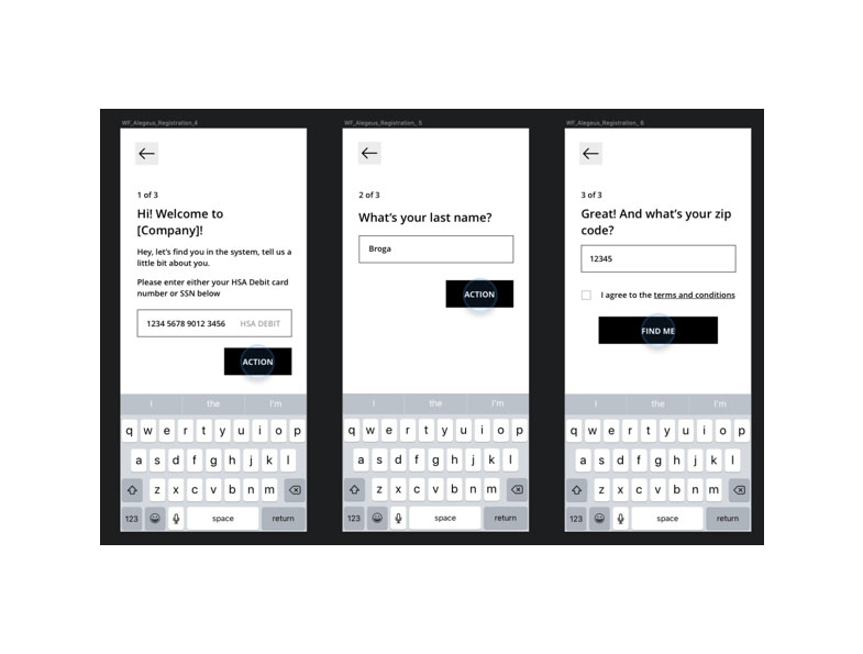
By using progressive disclosure, we can now allow the user to focus on specific questions that the app needs to ask them and use the space to provide more context into the questions. The isolation of related information per screen helps us control the users attention and lessen cognitive demand.
DRIVING BUSINESS VALUE THROUGH DESIGN
Engagement Through Clear Expectations
To create intelligent artificial intelligence experiences, we need to learn a lot about the user. This requires the user to input a lot of data so that the system can learn from them. To help engage the user, we prioritize communicating clear expectations from the users such as estimated time, value, and concepts.
Staggered Onboarding Experience Solutions
We realized the value of giving the user control over what they can give readily and what things they need to fulfill at a later time. We reviewed how we can structure the onboarding flow so that the user won’t be stuck on a long flow that can be skipped, but rather choose a section of the flow when convenient.
Promoting Continuous Experiences
When the user finished particular flows from the system’s required data input, the system should suggest a continuing path for the user and engage them in doing more for the application.
Conversational Communication
In an effort to increase the visibility of the app’s artificial intelligence and to design the input requirements to be more approachable, we made the app more conversational when communicating to the user.
Intelligent Suggestions
We want the app to be two steps ahead of the user, so having instant suggestions on any situation, like user input, will likely lessen the efforts of the user navigating or inputing data, making the experience less demanding and easy.
Home Page Experience Planning
The biggest content area we designed was the homepage. This is the page that would hold a lot of marketing potential and is a page where all users would most likely land on, so determining the functionality and content was critical before we even produced visual ideas.
Home Page Solution Exploration
A lot of work was put in the home page ideation to find ways to design the information and give enough visual emphasis to objects that needed to stand-out without de-emphasizing other important information.
Final Solution Mock-Up High Fidelity WF
To communicate our ideas on how to emphasize and visualize information, we had to increase the fidelity from block-frames to high-fidelity wireframes to help the client see our vision.
HSA Score Integration
Since this is a primary addition to the experience, we designed this feature to be visible and accessible throughout the application and gave it a distinct look.
Artificial Intelligence Integration
The application’s AI also needed to be visible throughout the user’s experience with the application, so we needed to design ways to display instances of the the app’s AI visibly communicating to the user.
Contextual Action-Based Home Page Paradigm
We created a paradigm where the homepage is smart enough to surface what the most-likely action the user would take at a given time. With this design, the AI becomes more visible, and the application has control to drive the user’s engagement in order for the app to learn more about them.
HSA North Star Visual Cocept
Alegeus’ marketing team came up with the north-star analogy for branding their HSA scoring feature and they wanted to find a way to implement the shape along with the visualization of progress. In our design, we hit both requirements and also created the star to be an interaction point to access anything related to the HSA score.
Smart Headers and Action Trays
We implemented smart headers and trays that collapse and expand respectively when you scroll down or up to give the user more real estate in viewing their contextual action cards.
PRODUCTION HIGHLIGHTS
Backlog Planning
In order to have a list of goals to hit and clarity towards priority and estimated hours, we created a backlog that we share regularly with clients so they can see details about production and budget.
Agile Workflow
Iterating different features needed to be designed between two designers in different timezone had great production cadence because of the agile method we used to establish different responsibilities and see progress between team members
Sketch File Change Tracking with Multiple Designers
Our designers worked efficiently despite having different time zones because of the version management tools they used to control changes and updates.
Production Lines
Both designers used a visual paradigm of having production stage lines to know which screens are ready for the next stages of exploration and production.
Objects and Components
We wanted to give the client assets as objects and components so the design is consistent and scalable even for future features that they will add to the product.
Type and Spacing System
We’ve established a simple type system in order to create consistent legibility throughout the app experience. We determined our size variations and spacing rules using mathematical scales to have the typography and visual affordances proportionate to one central value.
Re-branding Capabilities
Since this application is a white-label product, we established a system where our design file can simulate single-variable changes to color and type in order to show how a single variable can change how the app looks when their clients request a change to suit their own brand properties.
LONG-TERM RECOMMENDATION
Experience Enhancements
Since the project is very short, we wanted to give long term experience suggestions to the client so that they can consider these as they implement the new experience to their product.
Deeper Gamification Strategies
Since the project is very short, we wanted to give long term experience suggestions to the client so that they can consider these as they implement the new experience to their product.
Tech Suggestions
Designing the experience does not stop at the production of the application. The service itself should be experience in all other related technologies and possible access-points.
HAND-OFF
90 Clickable Wireframes
Wireframes were handed off in InVision with tour points and notes for important information we need to relay per screen.
20+ Visually Designed Screens
These screens will also be submitted through InVision for viewing and for special notes, but will also be exported to Zeplin for development information.
Sketch File
Styles, color pallets, symbols, layout configurations, and organized layer systems have been insured for easy hand-off to other designers who will be working with the file.
App Review Document
We also created a review document to give to the client in an effort to try to impart as much value as we can in the short amount of time we have with them.
CONCLUSION
After a short four weeks, we successfully delivered a new registration and onboarding flow, a brand new home page with new functionality, and we’ve integrated the visual presence of the AI and also created an experience for the company’s brand new HSA scoring system.


